Ideation and Concept
- Sep 17, 2025
- 3 min read
Weeks 1–2 Dates: 9/8/25-9/17/25
Original pitch contributions
The original idea for this short film was conceived as a group effort over the summer before the project officially started. I was lucky enough to be part of that group and give some ideas for the design and story.
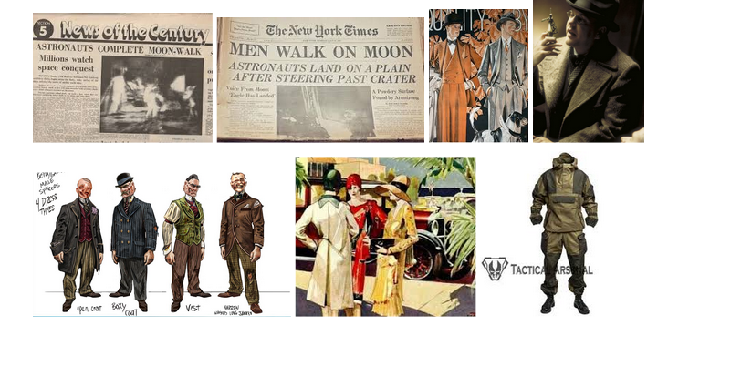
In a small team, we bounced ideas off of each other until we landed on the idea for a post-apocalyptic world taking place in a Soviet Subway Station. The team and I kept a document of our thoughts and ideas. My contribution was mainly in the visuals and the inspiration. Some of the major influences of Bioshock and Fallout were brought to the table by me, and a fair bit of the original concept pictures were selected by me as well.
Concept
After our team's pitch was chosen by the class, I was chosen to come up with concept art and the art pitch to the production team.
After the class discussed the direction we wanted to take the film, I heard it mentioned a few times that we wanted a style distinct from other post-apocalyptic media like Fallout and Bioshock. These two pieces of media were very heavily inspired by American design aesthetics, so I thought it would be good to find a style at least partially separate from them.
After consulting my concept teammate and one of my producers, I decided on a design direction to head in. We would be mixing American Art Deco, which I believed would bring to mind other post-apocalyptic media, and Russian Suprematism and Constructivism, which I believed would give it a style unique from other media. Both art movements used the same design principles, so I believed they would mesh well.

Using these images, I came up with a shape language of geometric shapes and bold colors. I created a series of color palettes I thought would capture this well. These palettes focused on bold colors: deep reds and purples, muted greens and yellows.

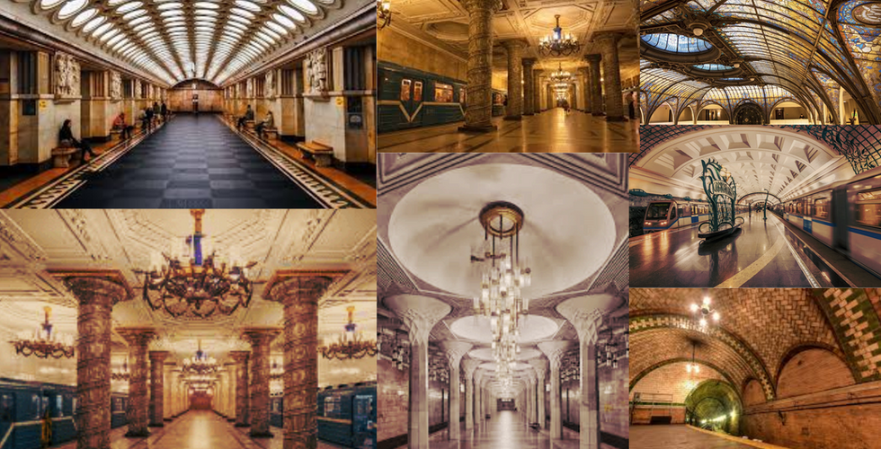
Using this as a springboard for set design, I cultivated a collection of train stations, train cars, and train interiors that I believed would be good inspiration and reference. The collection included Soviet and New York train stations, Soviet 1960s and New York 1920s train cars, and London train car interiors.
After talking with the story team, there seemed to be a major emphasis on poisonous flowers and stained-glass. I searched for images that I thought would fit both the color palette and shape language. The flowers were all rich colors and poisonous, while the stained-glass stayed in the Art Deco movement.
With a flower-focused world, I wanted to find references for what this might look like in the actual setting. Images of flowers in places that had been destroyed were rare, which was good for standing out design-wise, but made finding reference and inspiration photos difficult. In the end, I settled on a few images of plant-based deterioration and a few photos of fields of flowers.

I also had a specific vision for the lighting, wanting the air to seem thick and dusty. I also loved the idea of strong rays of light, god rays. With the stained-glass, there would also be colorful patches of light on the ground.

My favorite part of this design concept was exploring the clothing of the characters. The story team informed me that there would be an older man who was an ex-soldier with survivor's guilt and PTSD, and his daughter, who had died somehow. I wanted the characters to have opposite clothing styles while still existing in the same time period. The girl would have an outfit with strong silhouettes and bold colors. The man, on the other hand, would have a plain, shapeless outfit inspired by a Soviet war uniform and wear mostly gray.
I also included some artists whose work I felt matched the style. I picked an American Art Deco artist and a Soviet Suprematist artist.
Finally, I did a quick concept art sketch.

Below, I have included the final version of my concept pitch. The slides contain all that is mentioned here, as well as my notes, concept art from my concept teammate Danci, and the refined concepts that the production designers came up with.


