Boards, Posters, and Propaganda
- Oct 1, 2025
- 5 min read
Updated: Nov 11, 2025
Weeks 3–4 Dates: 9/18/25-10/02/25
Boards
For this block of two weeks, I was working on storyboards and posters. I have never done storyboards, so this was a learning experience for me. In the end, my storyboards were drawn over, but I will describe my experience with them anyway.
Another person, Pravav, did the original pass at the storyboards. Then, the director of photography and the director of our film met to discuss the camera movements and came to me and Pranav with their version of the boards. Our job was then to redraw them to make them more legible.
The main steps I made, as demonstrated in the pictures above, were to add a color code and symbols. The train door was a green rectangle. The man was blue with a square face and a mustache, while the woman was pink with a squiggle on her head. The train was a red arch with a dot in the middle, the generator was an orange cube, and the tent was a yellow 'v'. The stage wall was a black arch, and everything else was represented with a quick sketch and purple.
I added words underneath to explain my drawings and arrows to show both character and camera movement.
With two people on storyboards, they ended up not looking cohesive. My professor suggested that we make them look more similar to each other. Pranav ended up having the time to draw over mine, and so we went with his boards in the end. He did an excellent job, and the boards all share a similar style now.

Posters
I was also tasked with creating the poster for our film. The story has found its final iteration, and with that, the poster design has become easier.
The story is about a man who drinks tea made from irradiated flowers and hallucinates his wife, who is dead. Something is banging at the door that protects the man from the outside, and the generator that powers it begins to malfunction. After trying to fix it, the man accepts his fate and decides to sit with his wife instead of fixing the generator.
Hearing this version of the story, I tried to think of what objects carried the most symbolic weight. I landed on the tea, the flowers, the woman, and the man. I thought about ways of conveying that he was having hallucinations through the design and the poses. Something I kept coming back to was the wife covering the man's eyes.
Here are some of my thumbnails:

This was my first set of thumbnails; they depict a man drinking the tea while his wife covers his eyes. The only difference is, in the top version, the woman is made of the steam from the cup, and in the bottom version, the woman is real, and the title is made from steam.

This was my second idea of the thumbnails; putting a greater emphasis on the tea, with the man and woman being the secondary point of interest. With this one, the cup of tea is being held by the man, and in the reflection, the top of the man's face would be visible, with the wife covering his eyes.
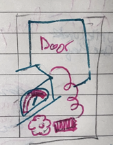
This thumbnail was my least favorite, and I made no iterations of it. It shows the door, the Geiger counter, and a single flower. The Geiger counter is showing that the flower has high levels of radiation. I thought that this one was not very interesting visually and lacked drama.

This thumbnail shows a spilled cup of tea, with the spilt tea forming the face of the wife. She would still have her flower crown made of poppies that were in the puddle. This one would be tricky to make, but I think it could be cool for a poster.
These two are iterations of the same idea. Since the story takes place in a train station, I thought incorporating the train tracks might be more intriguing. In both, the man and woman lie head to head on the train tracks while the man drinks tea. In the first version, the woman is made of steam from the tea and is in a death pose. The second has the woman being corporeal and covering her eyes. These were my favorites, but I kept ideating.

This poster idea has the man and woman sitting on the bench that they end the film on. They are both drinking tea, and the train tracks and door are in the background. This one felt a bit too sitcom for the tone of the story we have in our film. But the composition was simple, and it appealed to me a bit.
My plan with these is to clean them up a bit and show the crew to get a read on which ones they like the most. After that, I'll make mock-ups.
Propaganda
I am also ideating on some posters that will be put in the actual set of the film. As with the film design, I made a slideshow to gather references and decide on a style.
This is a collection of screenshots from my slideshow. I looked at posters that existed in the time periods our film is set, the 20s, 30s, and 60s. I looked at ads and movie posters, and propaganda posters for inspiration. Since our main style references were America and the Soviet Union, I made sure to include plenty of posers from both countries.
After ideating and gathering references, I made thumbnails. I won't go into as much detail with these, since I plan to explore them more once I gather more specific references.
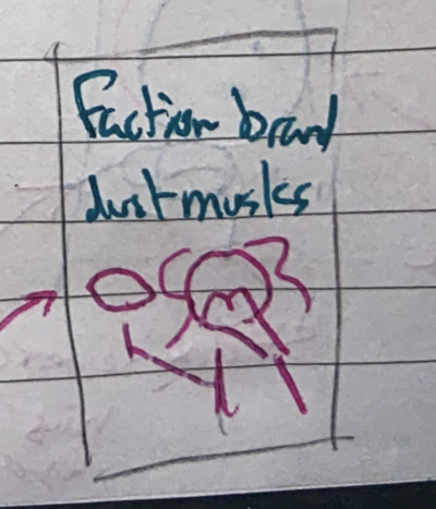
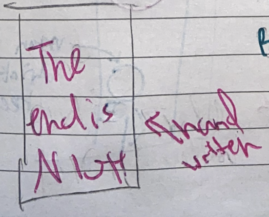
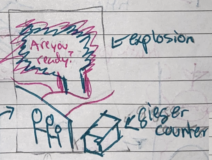
The first few ideas are in world posters advertising items. They would be purely for ambiance and style. They wouldn't add much if the viewer paused the film to read them. The rest I design intentionally to explain the setting and the props. The propaganda poster would explain that the story takes place in a fictional country at war. The train poster would explain that we are in what was once a train station. The "Are You Ready?" poster would explain both that the world has ended and what a Geiger Counter is. The poster proclaiming that the end is nigh would explain again that the world has ended but in a more humorous way. The last poster of the dust masks would explain the mask that the man is wearing.
I took some major inspiration from Wall-E for these, since that movie uses posters and ads to explain the world it takes place in as well.
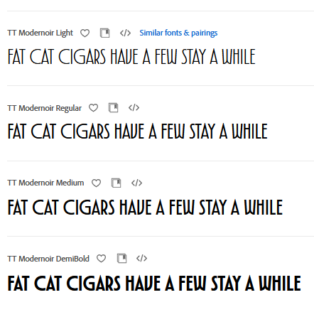
I also explored some possible fonts. I wanted the words to feel like they were written in Russian while still being identifiable as English. Since Russian is very pointy, boxy, and sharp, I looked at Slab Serif and Serif fonts. I haven't landed on one yet, but here are some fonts I looked at:
Finally, I made a first draft of one of the posters.

This is a first pass at a Cigar ad. There isn't enough contrast in the man's face for legibility, which is one of the first things I plan to change. I like the colors, though, and I think my composition evokes the references.
Going Forward
In the next two weeks, I plan to finish my background poster design and find a poster that the film crew likes to continue ideating. I also signed up to model a few things which is exciting.


